
Google announced its new design language in May. Material 3 Expressive redesigns have been rolling out to Google apps since then, but the Pixel 10 and Android 16 QPR1 launch really kicked things off. Here’s our list of what’s available and still to come on Android phones.
Updated 9/27: Refer to the table for what’s New and Updated.
Rolling out
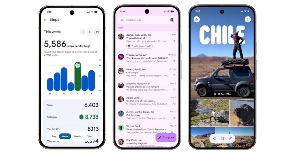
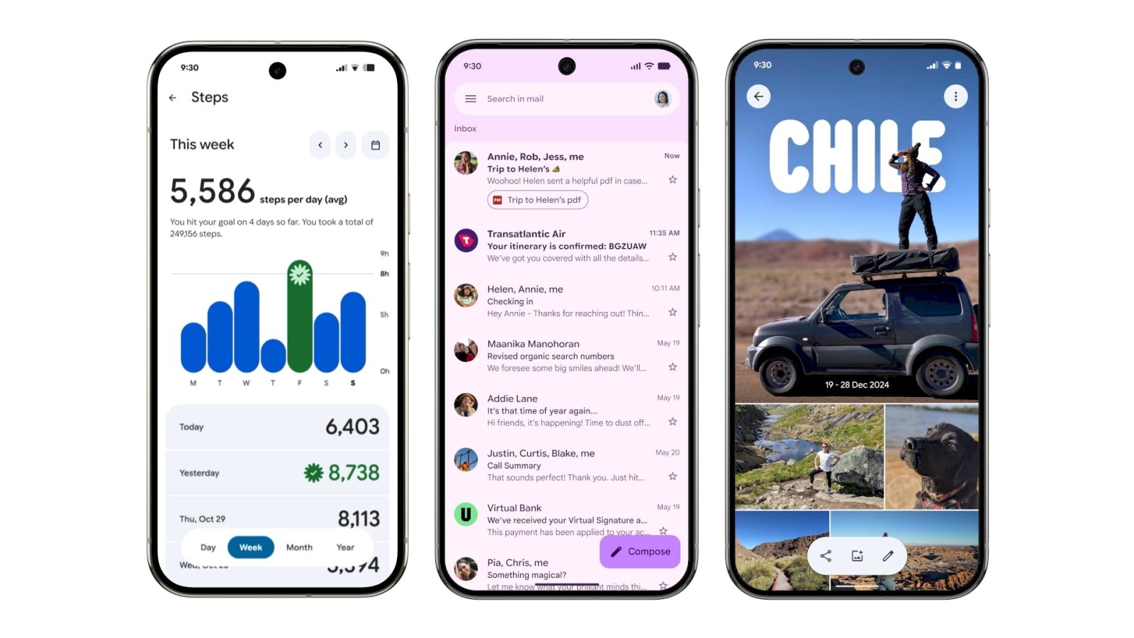
Gmail II
The next phase of Gmail’s redesign is placing each message on the homepage in a container, with a narrow left/right border now existing.


Google Chrome
On the main browsing interface, a partitioned Material 3 progress indicator is now used. Circular containers are leveraged for the top row of actions in the overflow menu. In the Tab Grid, the new tab button and standard/Incognito/Groups switcher are placed in containers. Google is also prominently theming the frame of Tab Group cards with the color you’ve selected.


Google Wallet
“Wallet” has been replaced by the app logo in the top-left corner, while the list of passes below the carousel makes use of thicker cards. Containers are leveraged throughout the app including the Add to Wallet and Recent activity page.
The NFC tap-to-pay animation is getting M3 Expressive. The background is now translucent with your card jumping up and down as part of a more animated success animation. Google is also introducing a new overlay for Pixel users with the double-tap power button gesture.


Recent launches
[New] Google Drive II
Google Drive has removed the main list view container for an edge-to-edge design.
Old vs. new


[New] Quick Share
The new fullscreen Quick Share experience takes full advantage of Material 3 Expressive.
[New] Google Maps
Listings in Google Maps now make use of M3 Expressive containers to better group information. Additionally, the actions carousel more consistently appears at the bottom of your screen.


Fully launched
(In alphabetical order)
Digital Wellbeing
Just the main page for this “app” (within Settings) has been updated with M3 Expressive. Besides containers, the donut graph is thicker. This is rolling out with beta version 1.30.x.


Files by Google
There’s an animated Material 3 carousel on the homepage with a pill-shaped toolbar for Quick Share and document scanning, while a navigation rail is now leveraged. When opening an image, there’s a toolbar for editing and Circle to Search. List views have larger previews at the left.
Find Hub
There’s a shorter bottom bar, while the sheet features more prominently rounded corners. One nice usability is how device pins are now larger.
Gmail
Source link
Disclaimer
We strive to uphold the highest ethical standards in all of our reporting and coverage. We blogs.grocliq.com want to be transparent with our readers about any potential conflicts of interest that may arise in our work. It’s possible that some of the investors we feature may have connections to other businesses, including competitors or companies we write about. However, we want to assure our readers that this will not have any impact on the integrity or impartiality of our reporting. We are committed to delivering accurate, unbiased news and information to our audience, and we will continue to uphold our ethics and principles in all of our work. Thank you for your trust and support.
Website Upgradation is going on for any glitch kindly connect at [email protected]