
Google announced its new design language in May. Material 3 Expressive redesigns have been slowly rolling out to Google apps since then, and here’s our list of what’s available and still to come on Android phones.
Updated 8/17: Refer to the table for what’s New and Updated
Rolling out
[New] Google Drive
This redesign starts with a search app bar, while the list/grid content view is placed in one large container. A connected button group is used to switch between the list/grid options.
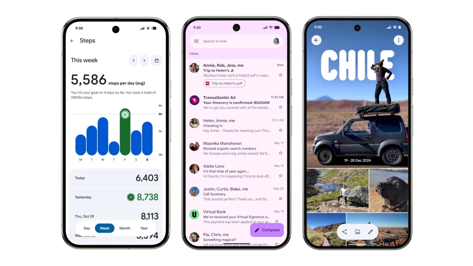
[Updated] Gmail
Your list of emails and the message are placed in a container, while there’s a prominent pill-shaped animation when using the swipe gestures.
Gmail is adopting the search app bar that moves the hamburger button and profile switcher outside of the field, which is now thicker.

[Updated] Google Wallet
“Wallet” has been replaced by the app logo in the top-left corner, while the list of passes below the carousel makes use of thicker cards. The Recent activity page has been updated with containers.
The NFC tap-to-pay animation is getting M3 Expressive. The background is now translucent with your card jumping up and down as part of a more animated success animation. Google is also introducing a new overlay for Pixel users with the double-tap power button gesture.
Digital Wellbeing
Just the main page for this “app” (within Settings) has been updated with M3 Expressive. Besides containers, the donut graph is thicker. This is rolling out with beta version 1.30.x.


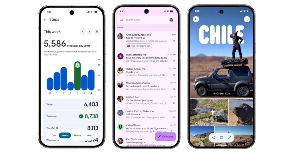
Google Photos
A new backup indicator at the top of the app replaces “Google Photos.” On launch, you briefly get a logo that animates into “Backup complete.” You can drag down (pull-to-refresh) to see cycling Material 3 Expressive shapes on a background layer that also notes how much you have stored in the cloud. When something is backing up, there’s a wavy progress indicator.
Google One
The app switches to a shorter bottom bar, while the cards (and Settings) are placed in more prominent containers. Meanwhile, Google One has removed its infographics for a denser app.
Phone by Google
Compared to other apps, Phone by Google is using Material 3 Expressive as an opportunity for a complete overhaul. The bottom bar goes from four tabs to three with Favorites and Recents becoming “Home.” There’s a new “Keypad” tab that replaces the FAB, while “Voicemail” is unchanged. Contacts can now be found in a navigation drawer. All calls and lists (including Settings) make use of containers.
The Incoming and In-Call screens feature updated buttons with larger touch targets. You can pick between Horizontal swipe or Single tap.
Google Keep
Google Keep makes use of the new M3 Expressive search app bar component that moves the hamburger button…
Source link
Disclaimer
We strive to uphold the highest ethical standards in all of our reporting and coverage. We blogs.grocliq.com want to be transparent with our readers about any potential conflicts of interest that may arise in our work. It’s possible that some of the investors we feature may have connections to other businesses, including competitors or companies we write about. However, we want to assure our readers that this will not have any impact on the integrity or impartiality of our reporting. We are committed to delivering accurate, unbiased news and information to our audience, and we will continue to uphold our ethics and principles in all of our work. Thank you for your trust and support.
Website Upgradation is going on for any glitch kindly connect at [email protected]