Last month brought our first look at Android 16 QPR2, with Google delivering its first beta just hours after the Pixel 10 launch event. Alongside other changes, the company is tweaking its monochrome icon settings first launched with Android 12, renaming the setting and finally auto-tinting icons that don’t follow Google’s Material You (and now, Material 3 Expressive) design recommendations. Nearly a month after this setting first changed, developers are getting some insight into the company’s plans for themed icons.
On the current Android 16 QPR2 Beta 1 build, you’ll find three settings available for icon customization: Default, Minimal, and Create. The latter currently doesn’t work; its icon seems to suggest some kind of AI-powered icon creation tool, but selecting it currently delivers an “app not installed” warning. Default is, well, what it says on the tin — the icon as created by the app’s developer, without any customization. Minimal, however, is effectively two things. For apps that properly support Material You, your icons will match the colors you’ve selected in Google’s customization tools. For those that don’t support Material You, however, icons will now auto-tint based on the rest of your color packs.
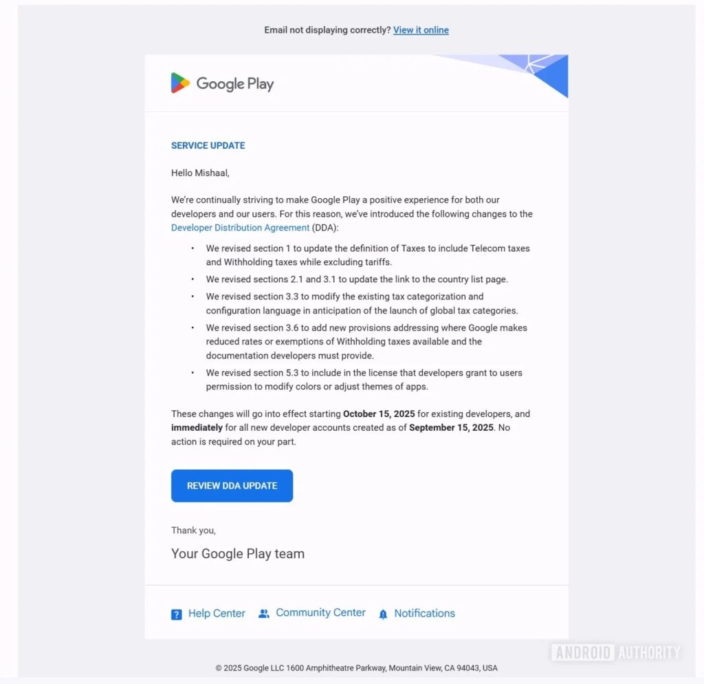
As spotted by Android Authority, Google is finally addressing those changes to developers after nearly a month’s worth of silence. Beginning on October 15th for existing developers, revisions to Google Play’s Developer Distribution Agreement (or DDA) section 5.3 will specifically force developers to “grant to users permission to modify colors or adjust themes of apps.” For new developer accounts, those changes went into effect immediately on September 15th.
Effectively, this circumvents any potential problems arising from modifying a brand’s icon, which often violates the guidelines laid out for utilizing company logos and other imagery (as an example, here’s Google’s Brand Resource Center, which tells you what you can and can’t do with the Google logo). With Android 16 QPR2 set to ship in the next couple months, presumably with forced theming in tow, this was a necessary step on Google’s part to ensure it didn’t receive takedown notices from various app developers, especially from large companies like Amazon. These legal warnings almost certainly wouldn’t have been sent to users, both because of the scale of such an operation and because there’d be no way of knowing who themed what icon.
Forced themes have been a long time coming. Google has spent the Material You era heavily suggesting developers follow Android design guidelines, and while plenty of app developers have relented, a large percentage of applications have not. While I don’t think the current tinted icons look great per se, it’s taking a page out of Apple’s playbook, which immediately forced themed icons with iOS 18 last year. While it’s…
Source link
Disclaimer
We strive to uphold the highest ethical standards in all of our reporting and coverage. We blogs.grocliq.com want to be transparent with our readers about any potential conflicts of interest that may arise in our work. It’s possible that some of the investors we feature may have connections to other businesses, including competitors or companies we write about. However, we want to assure our readers that this will not have any impact on the integrity or impartiality of our reporting. We are committed to delivering accurate, unbiased news and information to our audience, and we will continue to uphold our ethics and principles in all of our work. Thank you for your trust and support.
Website Upgradation is going on for any glitch kindly connect at [email protected]