
Google announced its new design language in May. Material 3 Expressive redesigns have been rolling out to Google apps since then, but the Pixel 10 and Android 16 QPR1 launch really kicked things off. Here’s our list of what’s available and still to come on Android phones.
Updated 10/30: Most Google apps now have M3 Expressive.
Recent launches
[New] Google Chrome
Circular containers are used for the top row of actions in the three-dot overflow menu. In the Tab Grid, the ‘new tab’ button and standard/Incognito/Groups switcher are placed in containers.


[New] Pixel Camera
The Camera redesign sees various button shape tweaks that help emphasize what’s currently selected. The Settings panel is shorter, while the main list benefits from Material 3 Expressive containers and a general reorganization.
Fully launched
(In alphabetical order)
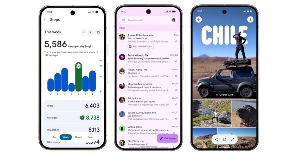
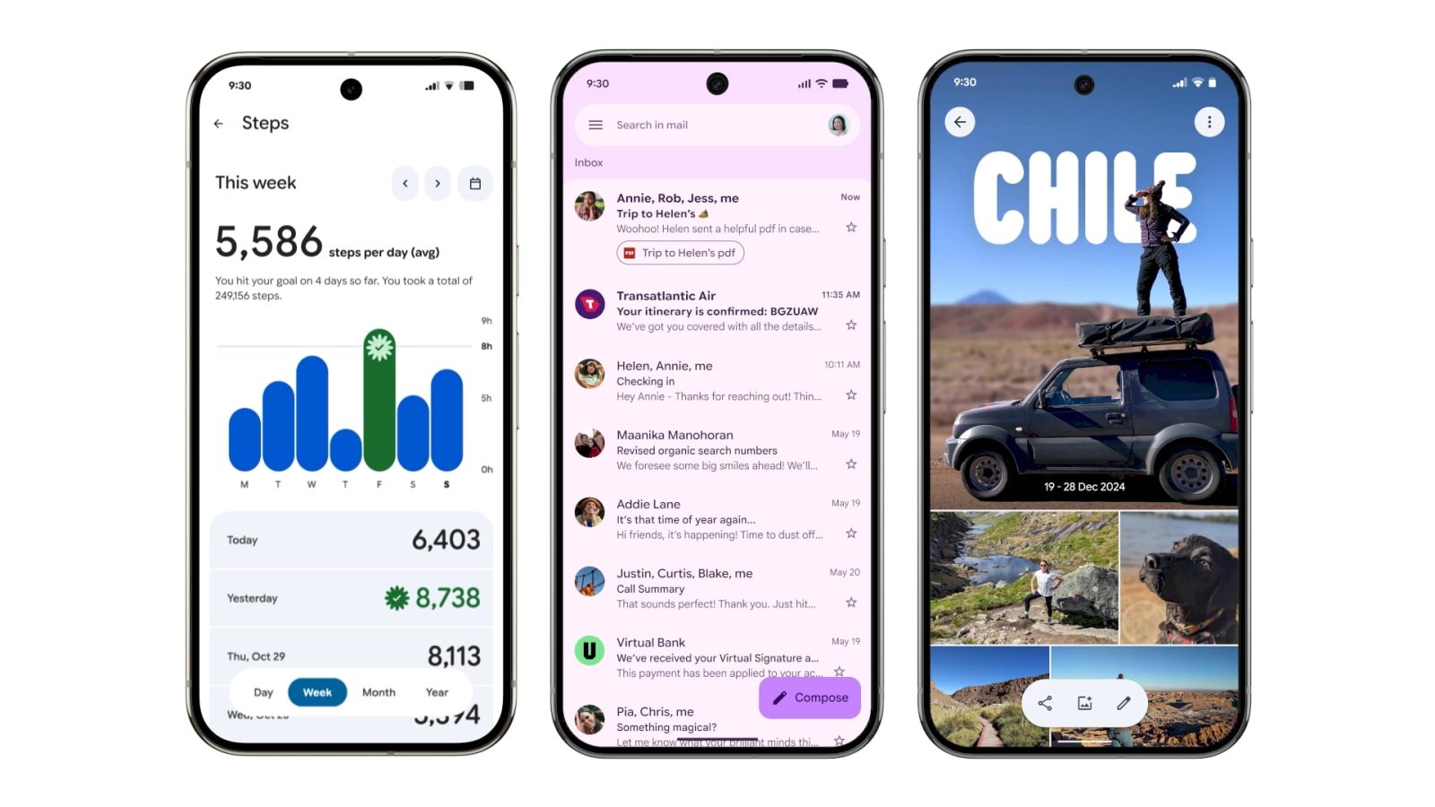
Digital Wellbeing
Just the main page for this “app” (within Settings) has been updated with M3 Expressive. Besides containers, the donut graph is thicker. This is rolling out with beta version 1.30.x.


Files by Google
There’s an animated Material 3 carousel on the homepage with a pill-shaped toolbar for Quick Share and document scanning, while a navigation rail is now leveraged. When opening an image, there’s a toolbar for editing and Circle to Search. List views have larger previews at the left.
Find Hub
There’s a shorter bottom bar, while the sheet features more prominently rounded corners. One nice usability is how device pins are now larger.
Gmail
Your list of emails and the actual message are placed in a container, while there’s a prominent pill-shaped animation when using the swipe gestures. Meanwhile, a search app bar sees the hamburger button and profile menu move out of the pill-shaped field.


Google Calculator
Version 9.0 hides the row of scientific functions, while there’s now a history button (but the slide down gesture remains).
Google Calendar
Time slots (hours and days) are placed in their own rounded container throughout the app’s various views (Day, Week, Month). This replaces the faint lines used previously, while there’s now a solid background layer in the primary Dynamic Color. More
Additionally, a FAB menu is now leveraged for Event, Task, Out of office, and Birthday creation.
Widgets will get a pill-shaped button in the top-right corner, while most views drop the two-column layout.
Google Chat
Like Gmail, Google Chat makes use of a chat app bar and places the list of messages in a container. The floating toolbar leverages a pill to highlight what tab you’re currently viewing, while the chat interface places the ‘plus’ menu in a vertical pill.


Source link
Disclaimer
We strive to uphold the highest ethical standards in all of our reporting and coverage. We blogs.grocliq.com want to be transparent with our readers about any potential conflicts of interest that may arise in our work. It’s possible that some of the investors we feature may have connections to other businesses, including competitors or companies we write about. However, we want to assure our readers that this will not have any impact on the integrity or impartiality of our reporting. We are committed to delivering accurate, unbiased news and information to our audience, and we will continue to uphold our ethics and principles in all of our work. Thank you for your trust and support.
Website Upgradation is going on for any glitch kindly connect at [email protected]