
I expected the dark-themed landing page to lose.
Everything I knew about conversion optimization said the light background should win.
Light themes are standard for B2B lead generation pages because they offer better readability, cleaner visual hierarchy, and align with accessibility standards.
Unbounce’s analysis of 41,000 landing pages establishes baseline patterns favoring light backgrounds. It seemed like a safe bet.
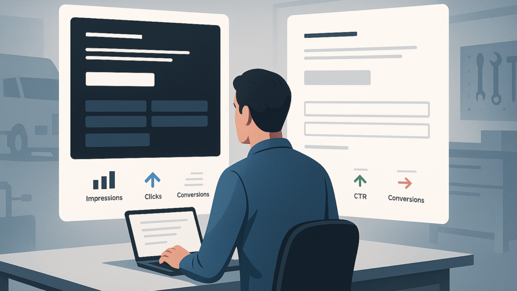
But after splitting paid traffic 50/50 between a dark landing page and a light landing page for our industrial fleet repair SaaS, the light variant achieved a 16.62% higher CTR yet delivered 42% fewer total conversions.
This isn’t an argument for universal adoption of dark themes.
It’s a case study in why audience context and industry-specific psychological associations matter more than following aggregate best practices derived from different populations.
Why light seemed like the obvious choice
We operate in a niche B2B SaaS vertical serving the transportation industry – specifically businesses that maintain commercial vehicles and equipment.
Our target buyers are shop owners and operators who spend their days in industrial environments managing technicians, equipment, and demanding commercial customers.
Going into this test, I had specific expectations.
- Light backgrounds would convert better for text-heavy lead generation pages. Professional B2B landing page design principles emphasize whitespace and visual hierarchy. For our 7-field form targeting busy shop operators, light mode with dark text should provide superior readability.
- Blue CTAs would outperform. Blue is commonly associated with trust and security, which are critical for B2B software purchases. Our treatment used a blue CTA button for this reason.
I was wrong on both counts.
Dig deeper: 5 tips for creating a high-converting PPC landing page
The test: Isolating visual design
We ran a standard 50/50 split test through Google Ads and Meta, directing traffic to two landing pages with identical copy but drastically different visual presentations.
The control featured a dark theme:
- Black background throughout.
- White text overlay.
- High-contrast white form fields on the dark backdrop.
- A black CTA button with a red outline.
- A dark overlay on the background image (trucks and an industrial environment).
- No brand logo in the header.
The treatment used a light theme:
- White and light gray background.
- Dark text on the light background.
- Light gray form fields on white.
- A blue CTA button.
- A lighter overlay on the same background image.
The brand logo was prominently displayed in the header.
We kept everything else identical, particularly the:
- Headline.
- Body copy.
- Value proposition.
- 7-field form structure (email, name, business name, phone, shop type, technician count).
- Page layout.
This variable isolation is critical. If you…
Source link
Disclaimer
We strive to uphold the highest ethical standards in all of our reporting and coverage. We blogs.grocliq.com want to be transparent with our readers about any potential conflicts of interest that may arise in our work. It’s possible that some of the investors we feature may have connections to other businesses, including competitors or companies we write about. However, we want to assure our readers that this will not have any impact on the integrity or impartiality of our reporting. We are committed to delivering accurate, unbiased news and information to our audience, and we will continue to uphold our ethics and principles in all of our work. Thank you for your trust and support.
Website Upgradation is going on for any glitch kindly connect at [email protected]